Maps to drool over

Yesterday I attended a talk on U of O’s upcoming Atlas of Yellowstone. It’s still in the early development and fund-gathering stages, but if it’s as lovely as their Atlas of Oregon, I’ll want to get a copy. The atlas is made from the compiled work of students, faculty, park representatives and data from a variety of sources. Some of the data is a proxy when the “perfect” data source isn’t available, and some is directly from the individual subject area experts form the Park Service.

One of the things I’m most impressed by with the the atlases is the consistency of color and style used in all the maps, charts and data. The consistency is great – but the color ramps, gradients, etc. are all so delicious that it’s hard not to blatantly “borrow” them.

Additionally, the Infographics lab also showed their beta of the new campus map. I wonder how difficult it would be to create a comparable tool for PSU. Especially one that didn’t require the various commercial software titles. It’s hard to beat the flash interface though. Vectors > Raster.
Stupid Baby Tricks

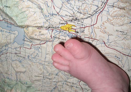
I suppose “stupid father tricks” would be more accurate, but I took this photo of Ella’s giant foot stepping on Cody, WY where I grew up. I picked up the extruded plastic topo map at the FOG map sale.
Ella Steps on Cody,WY

Mapping side project

Things have gotten boring with work, grad school and the baby, so I’ve decided to do a couple maps for Ooligan Press, PSU’s publisher. I’ll be creating some maps about Fort Clatsop and Lewis & Clark’s stay for a book about Fort Clatsop. Should be fun and will provide me with an opportunity to get some work published.

First map with MapServer

I’m taking a Web GIS course this term which will focus on using open source GIS tools such as MapServer, QuantumGIS and other goodies. Today was our first lab, which was mostly clerical stuff: accounts, file management, etc. The final product was a simple map made from a Quantum GIS export. Nothing fancy by any means. It’s basically a Hello World using the real world. I’m getting excited about the prospects though.

edit: the map is of landslides in the Portland area in 1996 during the big floods. I don’t know how to label yet – we were just setting up the server, etc. Soon…

On Printing

Tuesday’s lecture in my map design class covered printing/press issues. While much of the lecture was for historical reference only, I was surprised how much I already knew because of my college summer job working for Shields Printing. The printing process, quality control, on-job injuries, smack-talk about which WCW wrester was best and 115F temperatures all turned up in this last lecture. Plus, some of the darkroom techniques I learned in high school came in handy when looking at how final prints are set up. A classmate used the word syncronicity to describe the weird combinations of things she was noticing that afternoon and I thought it was very syncronicitous that she through out that word.

WWII Cloth Maps

fabric maps!
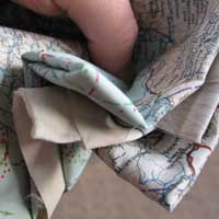
Over christmas my mother gave me some maps/charts that my Grandma had. They’re charts of the Pacific ocean with currents and political boundaries printed on some sort of fabric. This site suggests that the maps are printed on rayon, though others say silk. Apparently the idea came out of MI9, a sub-unit of British Intelligence as a means to provide compact, foldable maps that could be used for troops to escape capture and return safely. I’m not sure what the exact intent of these maps was, or what my great-uncle used them for, but they’re pretty damn cool.

The two I got (well, three – but two are duplicates) are an Army-Air Force series of Japan and the South China Sea (No. C-52) and a Naval Air Combat Intelligence-Hydrographic Office map of the Western Pacific with two sides for different currents during different seasons (NACI-HO No. S-12). The idea for the maps is pretty dark but really quite functional and they have definitely stood up well over time. I wonder how one goes about printing on silk with an ink-jet?

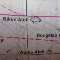
bikini atol
This one has the Bikini Atoll on it, which is one of those places you really hope you didn’t find yourself during WWII. Imagine looking for landmarks and seeing a mushroom cloud. That’d really inspire you to keep trying to find your way back to civilization.

We’re trying to think of something cool to do with the maps but it’s hard to decide because both sides have something. I’d feel guilty about making some boxers out of it, and well, scarfs just aren’t my thing.

Wayfaring and Google Transit

I spotted a link to Wayfaring from Urban Cartography. Looks like a lot of fun, but I think I’m mostly enamored with the page design itself. Lovely.

Also, Google Maps & Trimet launched a Transit project that seems less intuitive and functional than Trimet’s own route finder. The benefit is a visual map, I guess. I found the interface didn’t work when scrolling up and down.

Next? I hear there’s a MacOSX version of Google Earth coming. Woohoo!

Barley’s Mental Map

Every morning Barley runs down the front steps and takes a right. He’s gotten so predictable that I decided to let him lead the entire walk and see what kind of map formed. What made Barley’s mental map of the neighborhood? Was it the markings of other dogs? People?

Well, we never found out because we only made it to the end of the block before Barley had satisfied himself with the latest marking before looking to me to decide on directions. Not much of a map. The rest of the walk I tried to let him pick which way to go (except up people’s walkways) and it seemed his default was to go straight or look to me for some small cue about direction. I was a longer walk than normal and he never gave me the sad eyes when he realized we were turning back towards the house. Still, not quite what I was hoping for. No GIS project.