Gearing up. Again

I’m well sick of my thesis by now, but seeing as it’s year 3 of the slog, I’ve got to wrap things up. Well, it’s year 5 of all of it, but the first 3 were awesome, so they don’t really count. I took the summer off from my thesis because I wasn’t able to accomplish anything useful while school was out and one of my committee members was on sabbatical. Summer is over, so I’m back to looking for a replacement committee member (sabbatical was extended) and trying to present my topic, get human subject approval from the graduate office, and get in to the field to try some layer maps on 5th graders.

Luckily, I still enjoy the topic.

Student Atlas of Oregon is alive

I just got word from one of my instructors and the head of the Student Atlas of Oregon project that our work is now online. As always, it is satisfying to see your work, even if someone did make some changes to it. The final product is pretty nifty, and I suspect it will be much more useful to middle school students than any other current collections of maps of Oregon.

I posted a work in progress view of the cross section map, but here’s the final product. I’d originally made it as a two-page spread, but the format of the atlas changed, and someone else merged the content for the final version.

Chaucer’s secret clues about the new world

You can view Chaucer’s Canterbury Tales online via Google. Since it has been googlized, you can also see how Google Maps picks out geographic places from the text and puts them on the map:

Rose, Nebraska

“For out of doute I veraily suppose, That he that wrote the Romant of the Rose, Ne coude of it the beautee wel devise..”

See that? It’s combining olde English and punctuation to get a place name: Rose, Nebraska. I’d say that Google is being geographically hyper-aware.

Color Scheme inspiration

This past winter and spring, I worked with the Center for Spatial Analysis and Research and Oregon Geographic Alliance on creating an Atlas of Oregon for students. You may think “hey, there’s already a gorgeous Atlas of Oregon, why create another?” Well, the answer should be clear. Because it would be fun. Actually, the reality is that the maps in the student atlas are much more simple, and largely much less aesthetically pleasing to the eyes of adults like ourselves. The maps are designed to fit existing middle school curriculum and communicate clearly the ideas that teachers in working with the Oregon Geographic Alliance have picked as most important. It was a lot of fun though.

One of the challenges that many of us faced was selecting color schemes that were bright enough to be engaging without being obnoxious. I had a difficult time coming up with a simple palette on my own. I’m much better at identifying good colors when I see them than coming up with my own matches, so I often turn to color-picker type web tools for help. But even with these tools I just wasn’t finding the magic. I had no way of knowing if my sensibilities were trumping colors best suited for kids. But then I got an idea.

One of the most important lessons I’ve learned from work is that there is probably someone somewhere who has faced the same situation at some point. The internet has been incredibly helpful in this regard, but for this project, something else came to mind. Who is really good at creating engaging, colorful products that catch the attention of children? Cereal companies. Think for a second about all the colors of not only the cereals themselves, but the packaging as well.

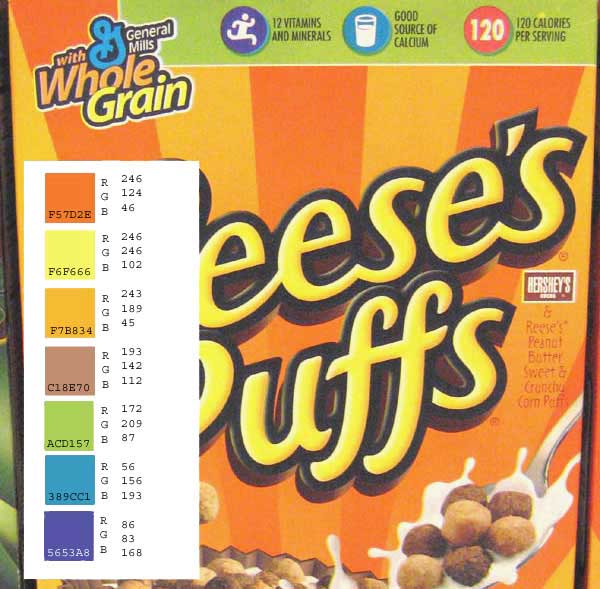
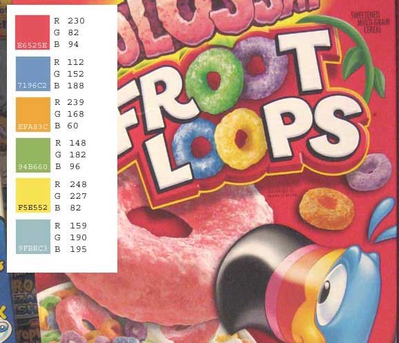
So, while grocery shopping with Michelle and Ella, I took some semi-clandestine pictures of the cereal isle and the candy isle. The candy packaging turned out to be too gauche, and often the palettes were too limited. Cereal boxes were a jackpot. Out of several options I ended up picking Froot Loops and Reeces for their engaging colors.

Reeces box Froot Loops

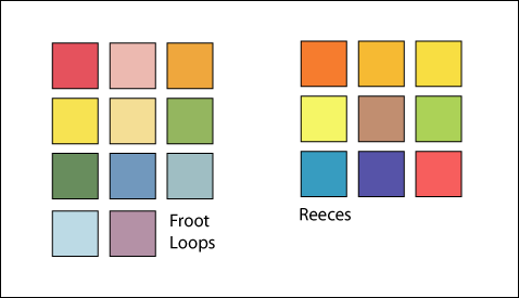
From these boxes I picked out a swatch of colors to use in these atlas maps. I used them fairly consistently throughout the project, and they worked very well for a few maps, and not at all for others. Some reference maps without much data on it (Cities, for example) didn’t have enough variety to require a whole palette, and none of the vibrant colors worked well as a background. The swatches are far from perfect, but they look good enough on a number of maps that they seem like they may be engaging enough for students without insulting adult sensibilities. We’ll see if that ends up being true or not.

Cereal box Swatches

gCensus

Imran Hague has put together a set of libraries that work with US Census data and make it available to view in Google Earth. The project, gCensus, looks like a great start and will hopefully lead to greater use of the Census’ already excellent resource.

I couldn’t agree with Imran more about improving access to this data. Now, about displaying raw data with choropleth maps….

Mapping Hip-hop

A cultural geographer visited my digital atlas class a while back and shared some excellent maps of cultural phenomena, highlighting the variety of ways to use maps, but also in the variety of ways the people look at place. Some of the maps he shared showed regional nomenclature for things like pop (Soda, Coke, Soda pop, etc) and what people said where. Same with sandwiches (Subs, hoagies, po’ boys, grinders, heros, etc).

He also showed a map of hip-hop. I haven’t been able to find out the author or where it’s from, but it’s a fascinating look at music and culture. There are of course some glaring problems with it, but without knowing the cartographer’s intentions, we can’t really know exactly what his point was; or why certain things are emphasized and others not.

Map of Hip-hop

Click on the image to view the full-sized version. What problems do you notice? What would you change?

Eyes bleed chroma

I had a dream that my eyes were bleeding chroma, the gray value associated with the Munsell color system. It made finishing my maps impossible because the colors were all too bright. Weird, for many reasons, but mainly because I don’t like the Munsell system. I much prefer to work with HEX codes. RGB is ok, but harder to remember when you have to type in a lot of values. Time to use some eye drops.

Oregon cross sections

I’m working on a map of elevation cross-sections of the state of oregon for my Digital Atlas class. There’s a great utility Profile Toolthat will create a series of shapefiles from a DEM and geology coverage for use in fancy geologic lithography maps. I just wanted to create an elevation profile, so I used the tool without using the geologic identifications and now I just need to figure out how best to explain the concept. This is for a children’s atlas after all. I’m trying out ArcScene to see if there’s a nice way to show the profile lines.

Oregon elevation - click for a larger view

Google Earth: An Insurgent’s Guide

British Army intelligence are reporting that insurgents in Iraq are using Google Earth to pinpoint and attack their bases. From the Telegraph:

“Anyone with the internet can sign up to Google Earth and by simply typing in the name of a location they can receive very detailed imagery down to identifying types of vehicles.”

Well, not exactly. Assuming you have very detailed data, they can tell where you parked your vehicles 2+ years ago. Google doesn’t provide live data. I suppose if Coalition (there’s still a coalition, right?) would hurry up and bring peace, they wouldn’t have to worry about aerial data catching up.

In all seriousness though, the use of tools like Google Earth are easy to point the fingers at. If GE wasn’t available, there would be plenty of other resources for insurgents to use to help target stationary objects. I would assume that there are still paper maps, and someone that can fire a mortar would probably know enough math to triangulate based on map coordinates. GPS units are dirt cheap now too.

One of the perpetual fears of having geographic and other non-spatial data publicly available is that it will be misused. It is my belief that the benefit usually outweighs the costs, and anyone sufficiently determined will figure things out without the aid of tools like Google Earth. I have trouble believing that someone decides to mortar an army base because the software made it look easier.

Final map

I’ve just finished (well, not finished..) my WebGIS course map. I’ve done the 5 objectives and then some, but there are still a few things I’d like to work on – like querying. Still, I should finish up for a bit and work on my other final since it’s coming up first.

If you notice anything that doesn’t work, or would make it better, let me know. The labeling is a bit crappy, but I’m not sure how to fix that yet. Soon…