Found on Google Street View

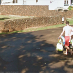
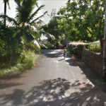
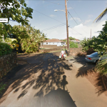
Last November, while the girls and I were hobbling barefoot to the beach, we encountered a Google Street View car making it’s rounds. The car is odd enough looking that the girls were curious about it. When I explained what it was doing, and that in roughly a year, we’d be able to see ourselves on the internet, they didn’t quite get it. Well, the photos finally went live, and there are several different views of us as we meander down the street while the car tries to capture the awkward dead end street.


View Larger Map

This was the first time that these streets had been mapped, so I suspect that we’ll be there for a while. Regardless, I screen-capped a few different shots to show the girls later. It might be one of those “and this was the first time you encountered the robots” kinds of talks.

Geographic Midpoint

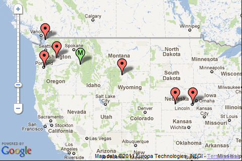
I was trying to figure out the most geographicly convenient place to have an off-site staff meeting and got distracted trying to find the temporally adjusted geographic midpoint for my life. GeoMidPoint gives you a nice Google maps API interface to add locations and time spent to calculate. I’ve been moving west consistently since I was born, and it appears that the geographic midpoint, weighted by time, is in the Salmon River north of White Bird, Idaho.

Geographic Midpoint of my life  (roughly White Bird, ID)

It’s the layers

Wednesday’s theme was layers. And the significance that comes from the interaction between them. And I suppose the effect that the combination of layers has on people.

First, I defended my master’s thesis. The topic was “The Effects of Multiple Thematic Layers on Web Map Use by Middle School Students.” Kind of boring, yeah, but I’ve grown fond of the topic, and I’d say given the response from my committee, they find now faults in my research. To sum it up in a sentence: “Combining multiple thematic layers on a web map will not negatively impact a middle school student’s ability to accurately answer questions with the map, nor negatively impact the response time in answering.”
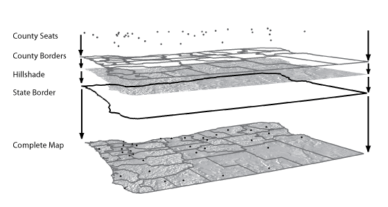
Illustrating the combination of layers on a thematic map

Ditto with adding a hillshade layer for terrain portrayal. The defense is over and now I’m left to make some surprisingly minor edits to the document before giving it to the school.

But layers can manifest in many ways. The next way can be summed up in this title: “The effects of multiple layers of awesomeness on my victory sandwich.” Yeah. Sesame bagel, some sort of cream cheese, course mustard, swiss, lettuce, tomato and turkey pastrami. I ate it out in the sun, hardly believing that I’d come to the conclusion of my graduate work. Barley got none.

Lastly, I went to see Battles (the band) at the Doug Fir lounge with my neighbor Eric. I was really happy to take Eric (when Scott bailed (boohoo, i tore the tendons off my finger and don’t want to drive 4 hours on a weeknight. Really though, thanks for the beer)) because he’d allowed me to pilot my thesis fieldwork in his classroom and he loves music. Plus, he’s just a fun dude.

The last manifestation of layers was in the music. In a somewhat awkward to see live way, the musicians recreated the fruits of their studio work for us to enjoy. I freely admit that most people won’t like the music – I’m sure it seems like absurd noise to most. But the show was fantastic, and the music can be described as somewhat accurately by the interaction of multiple layers of sound and timings to quite an excellent end. Plus, John Stainer is awesome. They all were.

It’s been really interesting to watch the appearance and now in many ways generally accepted practice of using samplers with live music. It’s a great tool in building and composing complex layers of sound, but it can often prove to be challenge to the in-person experience if the musician is not sure how to engage the audience and the music comfortably. It’s like being with someone who is constantly checking his phone through your conversation. The upside is that instead of another conversation, you get sweet, sweet music.

Did I mention I successfully defended my thesis? Yeah? Ok.
To sum things up

This is excerpted from the concluding remarks in my thesis:

Lastly, I postulate that if this research was repeated using a tool like Google Earth instead of a non-interactive web map that was specifically designed for children, the results would be different. The map and layers used in this test were designed to complement each other when combined. In a tool like Google Earth, the individual data layers come from a variety of sources and are not prepared with combinations in mind. I predict that maps in Google Earth would become more challenging to use, and response times would increase as layers were added. I suspect that this would be the case for adult map-users as well. Since there is currently no cartographer or designer curating the combination of layers, the haphazard symbology, changes in scale, differences in data quality, a poorly designed key, a mish-mash collection of data provider logos, and the scourge of auto-label placement would result in a map equivalent of Frankenstein’s monster, not in a learning and exploration tool.

Yeah, i’m getting a little tired.

Early Results at Oregon Academy of Science

This past Saturday morning I presented the early findings of my thesis work at the Oregon Academy of Science annual meeting. Despite the 8am presentation, the whole thing went well. My advisor encouraged me to do the presentation, not because he’s the section chair, but to give me an opportunity to practice for my coming defense this Spring. Also, it forced me to prepare a consumable explanation of what I’ve been doing the last couple years.

The presentation was a quick 15 minutes, but I think I was able to distill the results so far in to something that made sense to the audience. I received a number of great followup questions, and was happily able to respond to all of them. My advisor later said he was impressed at the presentation which in some way could be taken as a jab, but he’s not seen my findings yet. The draft I have now (and should be working on) is rather crude. But I should get back to that.

Fieldwork, day 3

On Monday, I hit the road again back to McMinville for another data collection trip to another 5th grade class. Despite how attractive Yamhill County is, I am glad that I won’t be spending another 2 hours in the car for 20 minutes of fieldwork. I’m very appreciative of the teacher and her students though, and of the lab manager at both schools in McMinville for helping me overcome some of the IE-based problems with the testing apparatus (read; Blackboard)

Upon arriving at Columbus Elementary, I was momentarily mortified when the woman in the head office said the teacher wasn’t in today. I assumed she meant that the teacher was at one of the other 2 schools where she teaches. Luckily, she simply meant that the teacher had a sub who was informed of what we were doing.

The class piled in to the lab after I’d logged all the machines in, we did the intro, and they took off. There was a noticeable difference between the early and late finishers, time wise. The last two sessions didn’t have such a long span between the first and last student. I’ll be interested to see both the biographical and the times in the results.

Again, after thanking all the students, I rewarded them with giant pretzels (many of the students had never seen such a thing) and peppermint candies. Then I excused myself to drive back to work. In the car I enjoyed a few pretzels myself, but then realized I didn’t have any water to help wash them down. This is when I started getting calls from work. I frantically tried to swallow the crumbs and not sound like a buffoon.

Note to self – check out one of the alternate questions on question set 7. The map didn’t come up for everyone.

Day 2 of fieldwork

Wednesday I drove south to McMinville’s Newby Elementary School to have a class of 5th graders run through my maps. Overall, the experience went well, though there were a few hiccups when some students tried to save a few questions, and many of the screens were 15″ rather than the desired 17″, but 23 students were able to complete the test with only a few bumps. It was a lot of time in the car for about 30 minutes of testing, but such fieldwork (I suspect.)

First official field work

This morning I visited Tualatin Valley Academy where a class of 7th graders took my thesis maps for a spin. After the revisions I made following the pilot, I was curious to see how long the tests took, and if any other problems arose. I got to the school rather early, logged in to all the workstations, and set up an example on the projector. The students filed in after a period change and automatically separated themselves by gender (it was rather comical to see girls in one corner, boys in the other). The introduction was quick, organized, and done in about 3 minutes. Then, the students started, quickly and quietly moved through each of the questions, finishing in less than 13 minutes.

When I thanked them and said that I was astonished how quick it went, several said they’d be happy to hang out in the lab longer so they didn’t have to go back to class (classic teen). I pointed out that they’d probably be more eager to go back to their classroom since they couldn’t (pulling a box from underneath my coat) eat these donuts in the computer lab.

I have to admit, I was a little shocked at how quickly it went (and how positive and complete the results are). Whether the difference has to do with changes I made to the quiz, to the introduction, or if it was simply the age and understanding of the students will have to shake out over the next couple tests. The next is tomorrow in Newberg.

Thesis Methodology Test

Note: This was supposed to have been published on May 19th. Not sure how it got stuck in the queue.

Note 2: Oh yeah, I dictated it in to my phone on the drive home then tried to have it auto-recognized. The grammar is atrocious.

I tested my thesis methodology in my friend Eric’s classroom on Monday. It quickly became clear that there were some problems in my methodology, and that I’ll need to adjust before doing live data collection. However, there are also some differences in on the actual set up as in the methodology and we encountered on Monday and the biggest was that it was not a lab situation where I could pre-configure the computers and accounts. Instead, we took maybe 20 to 30 minutes getting laptops passed around getting logged in and troubleshooting certificate issues while the students were waiting in front of the computers, which cost a precious 30 minutes of time.

The class is also a mixed fourth and fifth grade class so there were students from age 9 to 11 in the classroom and I think because of that rather than any other factor, there was a pretty big disparity between the who completed the test or not. They tended to be 11 rather than nine or 10 and up the students who did the best on it, and, you know, I can only say that based on the people actually saved answers and in with a question or two they all tend to be older.

I don’t think there was any take away data from this other than to make some changes in the methodology. It was definitely a humbling experience, and it was great to watch my friend work in his classroom and see such a beautiful mix of laid back and in control. I know that it was definitely fun on and it is clear that I’m not using the prescribed environment, so that was an interesting side effects. I still think that this is something that will be possible to use with him and think it will just simply requires some tweaking of the test itself and a maybe moving to an older classroom. Maybe get better results, which made the net looking for a group of students, so we’ll see what happens on. I am going to make changes to the exam length and my script to see what i can do to improve the time it took.

Verizon has “a map for that”

AT&T is suing Verizon over their there’s a map for that ads. AT&T is of course reacting poorly to a clever and powerful advertisement, but I understand their concern.

Verizon's 3G map
Verizon's 3G map

This is an intentionally misleading use of a map. Not only did Verizon pick a color for AT&T that’s difficult to see compared to the background, they are emphasizing total area covered, not total population covered. This is the same travesty you get when you look at 2004 election maps of red vs. blue states where it seems like the entire country is red when in fact it’s not the land that’s voting but the population.

Compare AT&T’s map to a map of population density:

US Population density

Notice how AT&T has service wherever there is any significant amount of population? They retort that they have 3G service available for 296 million customers. So they’re claiming they offer 3G service to 96% of Americans. I suppose the obvious question for Verizon is why are they spending so much time and money extending a 3G network to that remaining 4% of the population that is geographically dispersed, and where they’ll get such little return on their investment? Verizon isn’t in the game for community service, they’re in it to make money. If I were a shareholder, I’d be rather concerned, especially considering that Verizon will have to update their network. And that they have crappy phones.