To sum things up

This is excerpted from the concluding remarks in my thesis:

Lastly, I postulate that if this research was repeated using a tool like Google Earth instead of a non-interactive web map that was specifically designed for children, the results would be different. The map and layers used in this test were designed to complement each other when combined. In a tool like Google Earth, the individual data layers come from a variety of sources and are not prepared with combinations in mind. I predict that maps in Google Earth would become more challenging to use, and response times would increase as layers were added. I suspect that this would be the case for adult map-users as well. Since there is currently no cartographer or designer curating the combination of layers, the haphazard symbology, changes in scale, differences in data quality, a poorly designed key, a mish-mash collection of data provider logos, and the scourge of auto-label placement would result in a map equivalent of Frankenstein’s monster, not in a learning and exploration tool.

Yeah, i’m getting a little tired.
Early Results at Oregon Academy of Science

This past Saturday morning I presented the early findings of my thesis work at the Oregon Academy of Science annual meeting. Despite the 8am presentation, the whole thing went well. My advisor encouraged me to do the presentation, not because he’s the section chair, but to give me an opportunity to practice for my coming defense this Spring. Also, it forced me to prepare a consumable explanation of what I’ve been doing the last couple years.

The presentation was a quick 15 minutes, but I think I was able to distill the results so far in to something that made sense to the audience. I received a number of great followup questions, and was happily able to respond to all of them. My advisor later said he was impressed at the presentation which in some way could be taken as a jab, but he’s not seen my findings yet. The draft I have now (and should be working on) is rather crude. But I should get back to that.

Day 2 of fieldwork

Wednesday I drove south to McMinville’s Newby Elementary School to have a class of 5th graders run through my maps. Overall, the experience went well, though there were a few hiccups when some students tried to save a few questions, and many of the screens were 15″ rather than the desired 17″, but 23 students were able to complete the test with only a few bumps. It was a lot of time in the car for about 30 minutes of testing, but such fieldwork (I suspect.)

Verizon has “a map for that”

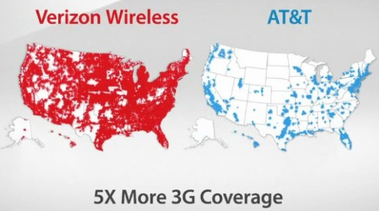
AT&T is suing Verizon over their there’s a map for that ads. AT&T is of course reacting poorly to a clever and powerful advertisement, but I understand their concern.

Verizon's 3G map
Verizon's 3G map

This is an intentionally misleading use of a map. Not only did Verizon pick a color for AT&T that’s difficult to see compared to the background, they are emphasizing total area covered, not total population covered. This is the same travesty you get when you look at 2004 election maps of red vs. blue states where it seems like the entire country is red when in fact it’s not the land that’s voting but the population.

Compare AT&T’s map to a map of population density:

US Population density

Notice how AT&T has service wherever there is any significant amount of population? They retort that they have 3G service available for 296 million customers. So they’re claiming they offer 3G service to 96% of Americans. I suppose the obvious question for Verizon is why are they spending so much time and money extending a 3G network to that remaining 4% of the population that is geographically dispersed, and where they’ll get such little return on their investment? Verizon isn’t in the game for community service, they’re in it to make money. If I were a shareholder, I’d be rather concerned, especially considering that Verizon will have to update their network. And that they have crappy phones.