This past winter and spring, I worked with the Center for Spatial Analysis and Research and Oregon Geographic Alliance on creating an Atlas of Oregon for students. You may think “hey, there’s already a gorgeous Atlas of Oregon, why create another?” Well, the answer should be clear. Because it would be fun. Actually, the reality is that the maps in the student atlas are much more simple, and largely much less aesthetically pleasing to the eyes of adults like ourselves. The maps are designed to fit existing middle school curriculum and communicate clearly the ideas that teachers in working with the Oregon Geographic Alliance have picked as most important. It was a lot of fun though.
One of the challenges that many of us faced was selecting color schemes that were bright enough to be engaging without being obnoxious. I had a difficult time coming up with a simple palette on my own. I’m much better at identifying good colors when I see them than coming up with my own matches, so I often turn to color-picker type web tools for help. But even with these tools I just wasn’t finding the magic. I had no way of knowing if my sensibilities were trumping colors best suited for kids. But then I got an idea.
One of the most important lessons I’ve learned from work is that there is probably someone somewhere who has faced the same situation at some point. The internet has been incredibly helpful in this regard, but for this project, something else came to mind. Who is really good at creating engaging, colorful products that catch the attention of children? Cereal companies. Think for a second about all the colors of not only the cereals themselves, but the packaging as well.
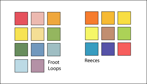
So, while grocery shopping with Michelle and Ella, I took some semi-clandestine pictures of the cereal isle and the candy isle. The candy packaging turned out to be too gauche, and often the palettes were too limited. Cereal boxes were a jackpot. Out of several options I ended up picking Froot Loops and Reeces for their engaging colors.
From these boxes I picked out a swatch of colors to use in these atlas maps. I used them fairly consistently throughout the project, and they worked very well for a few maps, and not at all for others. Some reference maps without much data on it (Cities, for example) didn’t have enough variety to require a whole palette, and none of the vibrant colors worked well as a background. The swatches are far from perfect, but they look good enough on a number of maps that they seem like they may be engaging enough for students without insulting adult sensibilities. We’ll see if that ends up being true or not.


i am always amazed at what goes through your mind…genius!
Brilliant idea!
Wow, great idea! Way to harvest the fruits of a consumer society!