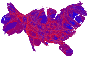
This image is a derivative of works by Michael Gastner, Cosma Shalizi, Mark Newman and Robert J. Vanderbei.
I must admit that despite its initial ugliness, it is a beautiful thing to see personally when compared to the typical electoral breakdown. This distorted ugly duckling does two things:
- It shows counties in a blend of red to blue rather than just a binary representation of presidential vote winners
- Then it does an areal distortion according to population, making areas with larger populations appear larger.
So? Well, it softens the polarized view of our country, so it serves a great propagandic purpose in making me feel better. Plus, it does a slightly better job of representing population than does the typical map of the US.
Also – The map of just the blended results shows an interesting pattern. Areas that are predominantly red are also areas with very little water. Are these people worried about their precious bodily fluids? Or are they hydrophobic? If you’re from the DNC, this might come in useful….