Yahoo maps is adding traffic overlays to their internet mapping tool. Although this is a first step, its going to take some time before it really becomes useful. Proper traffic info and access to the internet via cell will make it a much better resource for drivers.
Category: cartography
Creative Cartography – Envisioning Neu York
Artist Melissa Gould replaces New York City’s street and palce names with those from Berlin in an exercise to view 1930’s New York if the Nazis had defeated teh U.S. The map, called Neu York, may load slowly.
Its an attractive map with a unique perspective. Via filterfine.
The Power of Succinctness
I’m reading a book that has been deemed important to the discipline of cartography, and I’m loathing it. The writing style is excessive and whimsical to the point where I forget the point somewhere mid-sentence. I read a few sentences to Michelle, who felt the author had never taken a legal writing course. I checked Amazon’s reviews of the volume, and found that others felt the same way about the long lists of examples ending in ellipses. But I imagine the author’s own children may also take issue with his writing style:
“For 17 years I have supported their growth and participated in their development, helping them turn from mewling, all-but-helpless infants incapable of controlling their sphincters into the assertive and all but autonomous hulks who last summer roamed on their own around Manhattan.”
How embarrassing to have your father refer to your sphincter. The scary part is, I can almost see myself writing this way. I’ll try not to.
Map of Springfield
I’ve seen a couple maps of Springfield over the years in various games and such, but none so amazing as this compilation of Springfield. I’m quite astounded by the detail and just generally by the layout of the town. Its different than I imagined. And more city-like.
America, the Beautiful
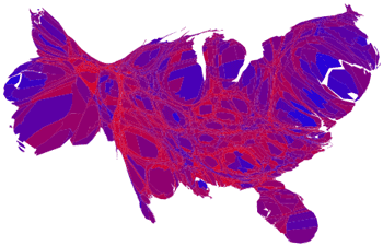
This image is a derivative of works by Michael Gastner, Cosma Shalizi, Mark Newman and Robert J. Vanderbei.
I must admit that despite its initial ugliness, it is a beautiful thing to see personally when compared to the typical electoral breakdown. This distorted ugly duckling does two things:
- It shows counties in a blend of red to blue rather than just a binary representation of presidential vote winners
- Then it does an areal distortion according to population, making areas with larger populations appear larger.
So? Well, it softens the polarized view of our country, so it serves a great propagandic purpose in making me feel better. Plus, it does a slightly better job of representing population than does the typical map of the US.
Also – The map of just the blended results shows an interesting pattern. Areas that are predominantly red are also areas with very little water. Are these people worried about their precious bodily fluids? Or are they hydrophobic? If you’re from the DNC, this might come in useful….
FundRace
In a brilliant fusion of public campaign contribution info, database querying, and internet mapping, the folks at FundRace have created a great source of curious entertainment.
You can browse by neighborhoods, cities, or the country. Or, you can search by name. My neighborhood is very pro-Democrat, but my parent’s is quite the opposite. Heck, it appears that most of the midwest is the opposite.
Crude Rubber Sheeting
Partly out of boredom, partly out of interest, and partly out of the avoidance of studying, I spent some time with some DEM files, some topo maps, and photoshop. I used MacDEM to combine some DEM files for the vicinity of Holden Village (holden quad, pinnacle mtn. quad, lucerne quad, etc). Then I used photoshop to combine some Topo sections I screen captured off of TopoZone.com. Finally, I layered them putting an opacity on the topo so you could see the shading from the DEM to get a rough but still kind of cool composite image. Both the DEM files and topographical maps are from the USGS.

Map-0-matic
Though I consider myself well travelled, I’ve been schooled by most of the others in the PDX blogging community. How do I fare? Only 27 states. I didn’t include states that I wasn’t aware of (wee tike). For the most part, my travels look like a fungus infecting the cool west side of the country.
Maps are fun.
create your own visited states map
or check out these Google Hacks.
Isorithm
One of the good things about isorithms in representing elevation is that they don’t make mountains look so much like anuses.

Here’s a pre-isorithm drawing of a mountain. See what I mean.
Map Published
Sort of exciting news, my Disc Golf map has been adopted by the course pro. See it at his site: http://www.fullondave.com/map.html.